
Using Different Paint Colours in your Home
Colour can influence our mood, feelings and emotions. That’s why it’s so important to choose the right colour scheme for your home. While you don’t need to paint every room in your house the same colour, there are a few things you can do to ensure each space has cohesion and harmony throughout your home. If you have an open floor plan, connecting your colours across each room can make your space look bigger and more inviting.

To help you get started, here are a few important thing to keep in mind when choosing your colour scheme:
- Use a single colour to connect the rooms. While you don't need to paint every wall in your home the same colour, you can carry a tonal element throughout each room to achieve colour continuity. For example, if you paint the walls in your kitchen a muted blue, you can choose a dark blue couch or pillows in the same colour for the living room. You also might even want to place a coordinating piece of art in a cool grey on the entryway wall.
- Use different shades of the same colour. When looking at a paint chip, they generally feature a light-to-dark progression of one colour. You can use these different colours in your home. Keep in mind that lighter colours on the paint chip should be reserved for entryways and common areas of the home, while the darker shades can be used for bedrooms, studies or semi-private living areas.
- Use the same group of colours. Consistently using three to five colours in all your rooms is another path you can go down. You can change up the dominant colour for each room to help make each space look distinct. While each room might look different, the eye will be able to recognise the common colours used.
Keeping these interior decorating tips in mind, we share the best paint colours for the three most important rooms in the home. As long as you use similar decorative elements in all your rooms, you can still paint each space a different colour while maintaining a cohesive look.
What paint colour is best for bedrooms?
When you spend a third of your life sleeping and relaxing in your bedroom, you want to ensure your environment is calming and will help you unwind. While the bedroom is often painted in a neutral white, beige or light grey, at Hotondo Homes we're seeing trends with clients choosing both subtle and bold colours that work just as well. Just a few of our suggestions are below:
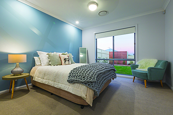
Blue: A light pastel blue is perfect for promoting a sense of calm, while a dark navy is becoming more trendy to create a statement feature wall behind the bed.
Dusty pink: A calming colour for any bedroom, dusty pink with earthy hues echoes back to the environment outside and suits a home where plenty of natural materials have been used.
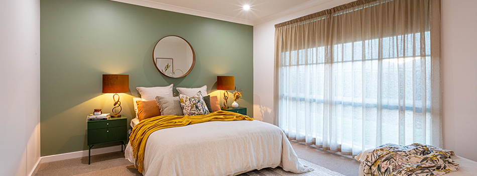
Sage green: Connected to feelings of tranquility and rejuvenation, sage green is a bold colour choice but will still keep you feeling calm and grounded.
Muted grey: Known as a colour that helps to balance our feelings, grey walls in your bedroom give you the opportunity to play around with accent colours for your pillows, furniture or bed sheets.
What paint colour is best for the living room?
When you want to kick up your feet and relax after a long day of working or looking after the kids, there’s no better place than the living room to do so. Put on your latest Netflix series you’re bingeing, and envision yourself with walls in any of the following colours:
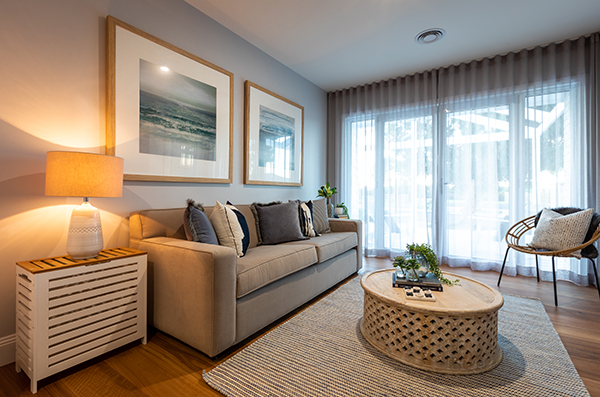
Taupe: Neutral and minimalist, taupe walls are an ideal choice for the living room as it is a clean slate in which you can add your own flair to with furnishings and accents.
Grey: Various tones of grey will suit a living space located in an open-plan area with a kitchen that features plenty of cool whites to create a sense of separation of space.
Pastel green: Perfect for a large space, a subtle mint green will allow your open-plan areas to appear separate from each other, and provide you with the ideal tones to add neutral accents with furniture, decor and artwork.
What paint colour is best for the kitchen?
The kitchen is the heart of the home, so you want to create a warm environment for family meal times. You’ll start your day here to make breakfast and a coffee, so it should be bright and bold.
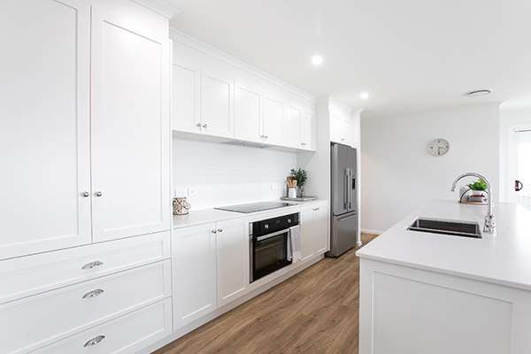
White: The ideal canvas for contrasting cabinetry and benchtops to sit against, a white kitchen will coordinate well with natural wood fittings, stone benches and a beautiful patterned tile backsplash.
Beige: A gorgeous warm, earthy tone, beige will work well with a smaller kitchen to create a cosy feel and will coordinate easily with other earthy tones in floor tiles and benchtops.
Grey: A very light grey wall colour with crisp, white cabinets will create the ideal coastal or Hamptons style look in your kitchen.
Ask Hotondo Homes
Do you need painting advice for your home? Our qualified and professional Colour Selections experts at Hotondo Homes are on hand to assist. Browse through our blog collection of interior inspiration to get ideas and advice on what colours best suit your space.
You can also head over to our preferred paint suppliers Haymes to view their range of beautiful neutral and coloured paints that would look incredible in your new home.